AWAY LUGGAGE
brand strategy
Context: 10-week group project | Parsons | Fall 2016
Personal Involvement: Project management, UX design research, Data analysis, Brand strategy proposal, Presentation design ( content and visual )
* Presentation modified for personal portfolio
CHALLENGE
How might we transform Away from a luggage brand to a travel lifestyle brand?
ABOUT AWAY
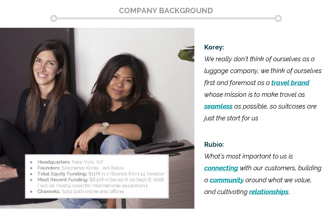
Background research about the industry, market, and Away.
AWAY AS IS
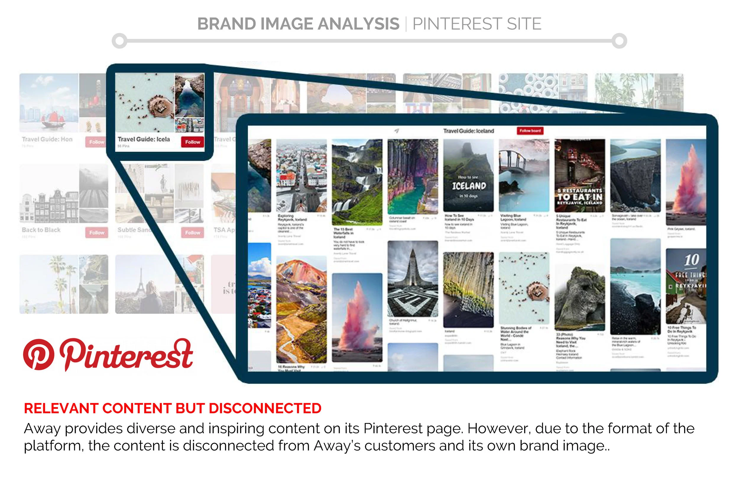
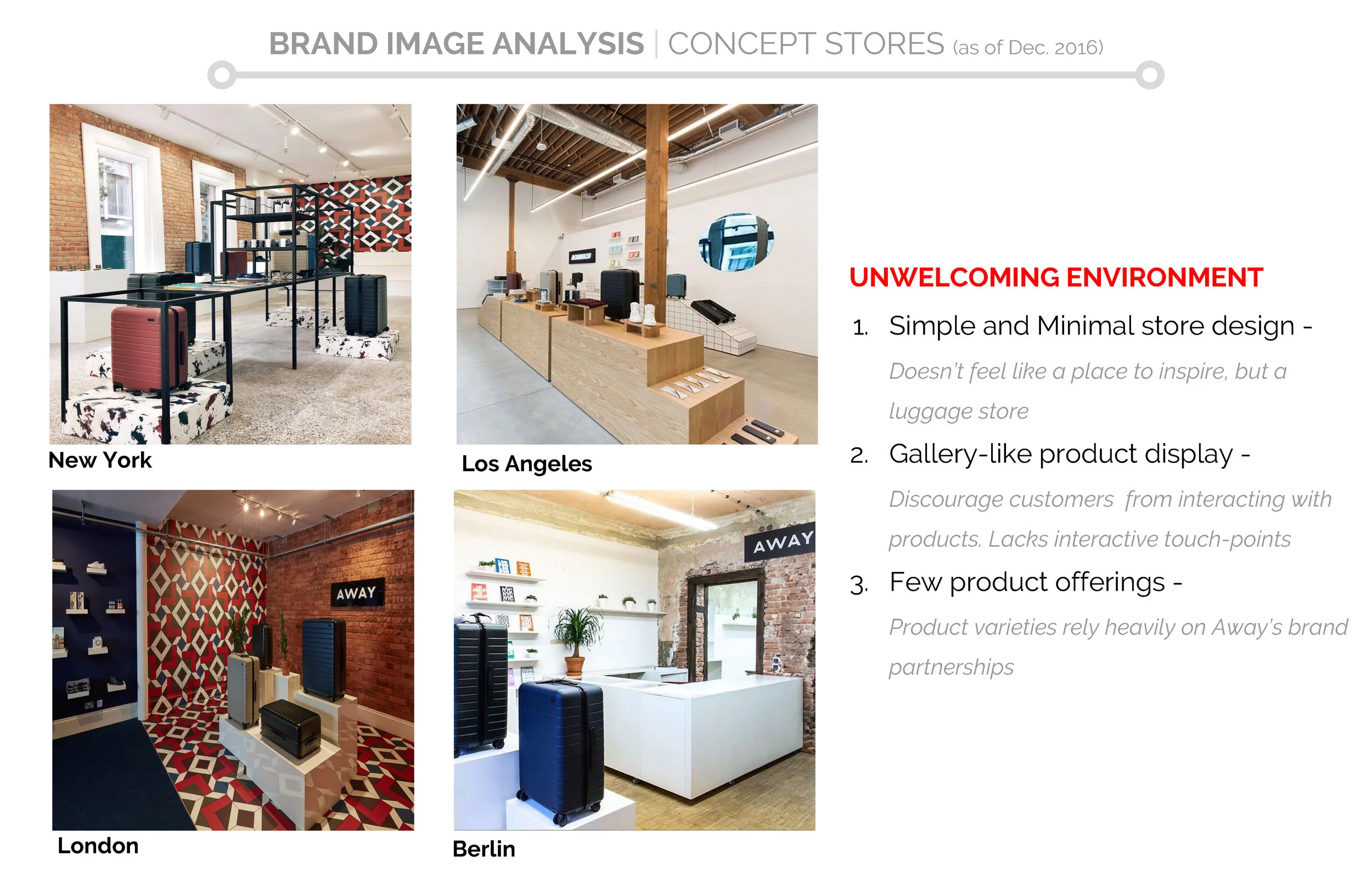
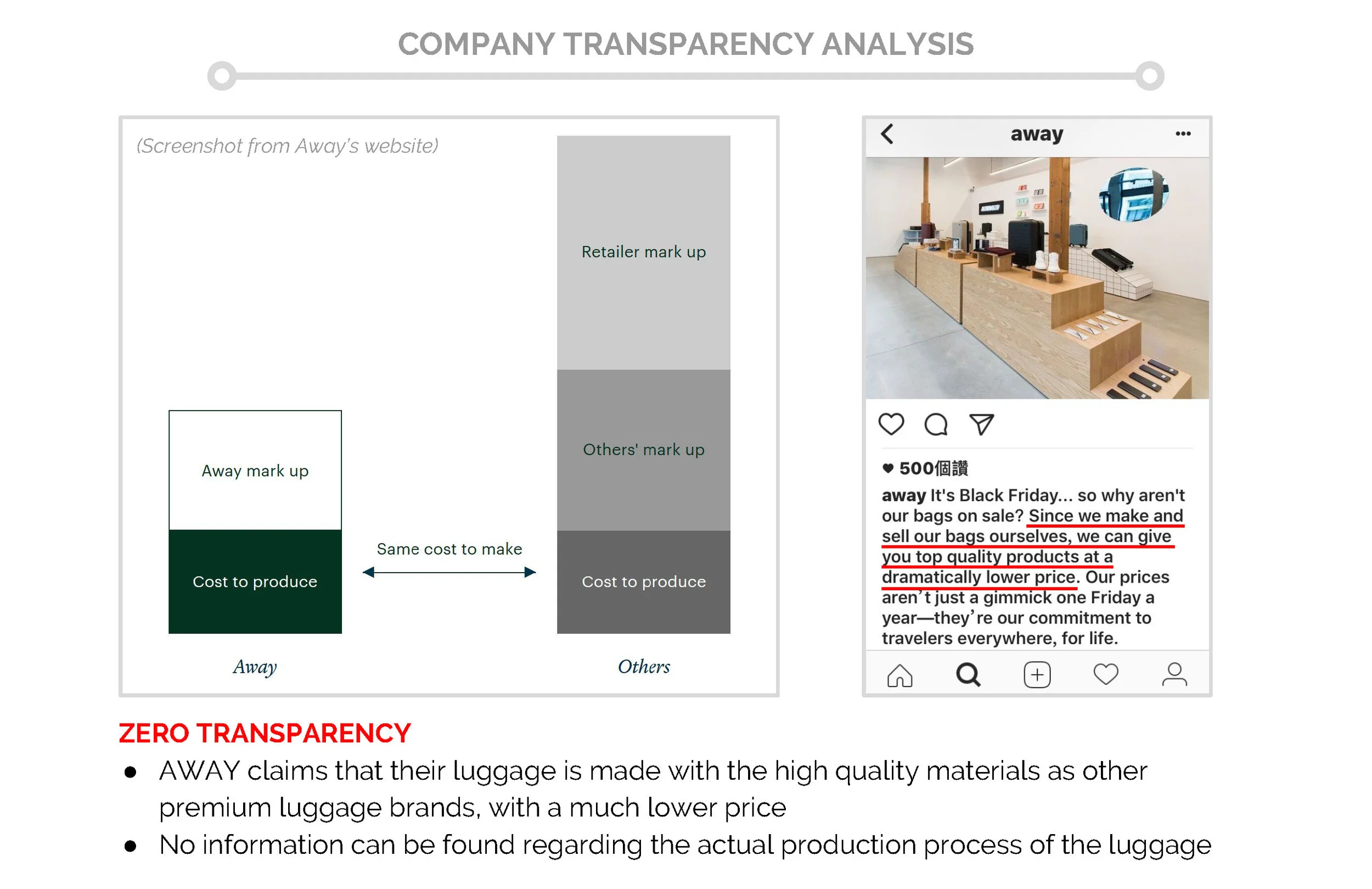
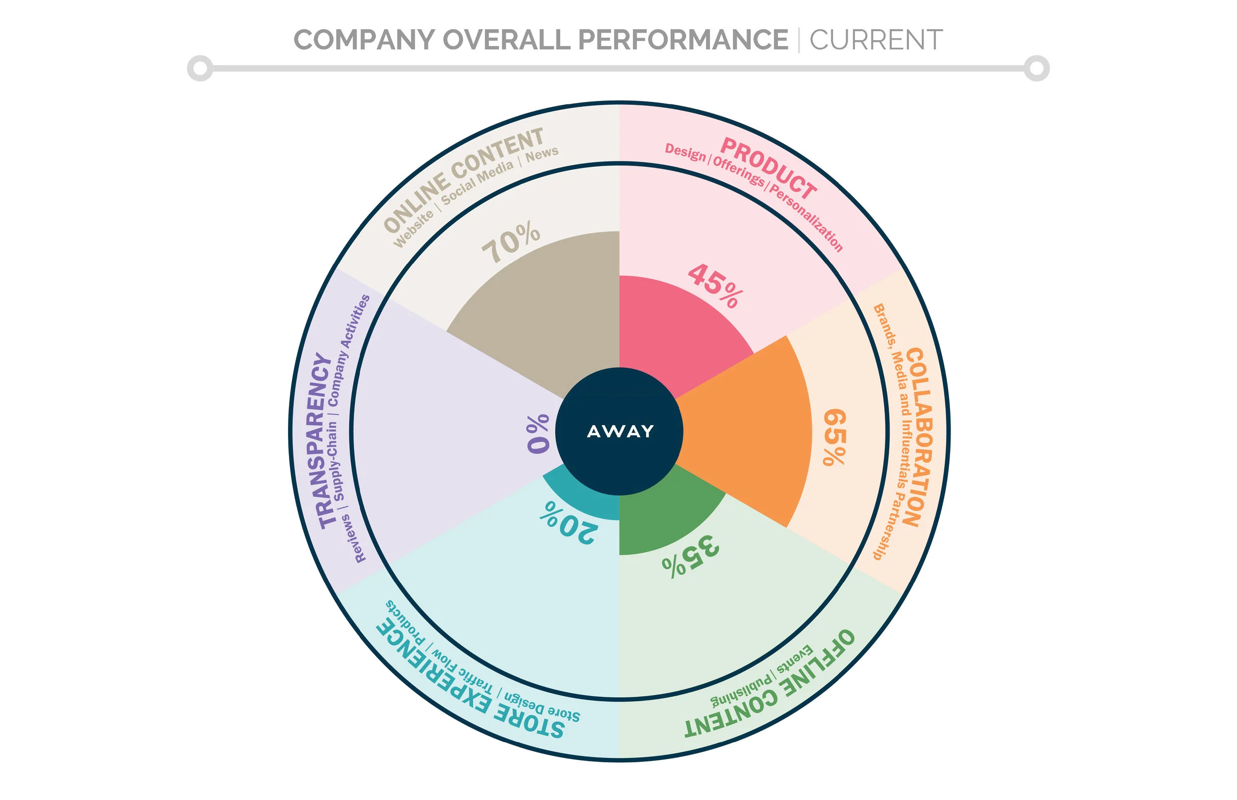
Using the 5 brand values to evaluate company’s current (Fall 2016) online and offline presence.
AWAY CAN BE
Proposal to ensure the company’s offline and online content meet Away’s mission and to improve its overall performance.
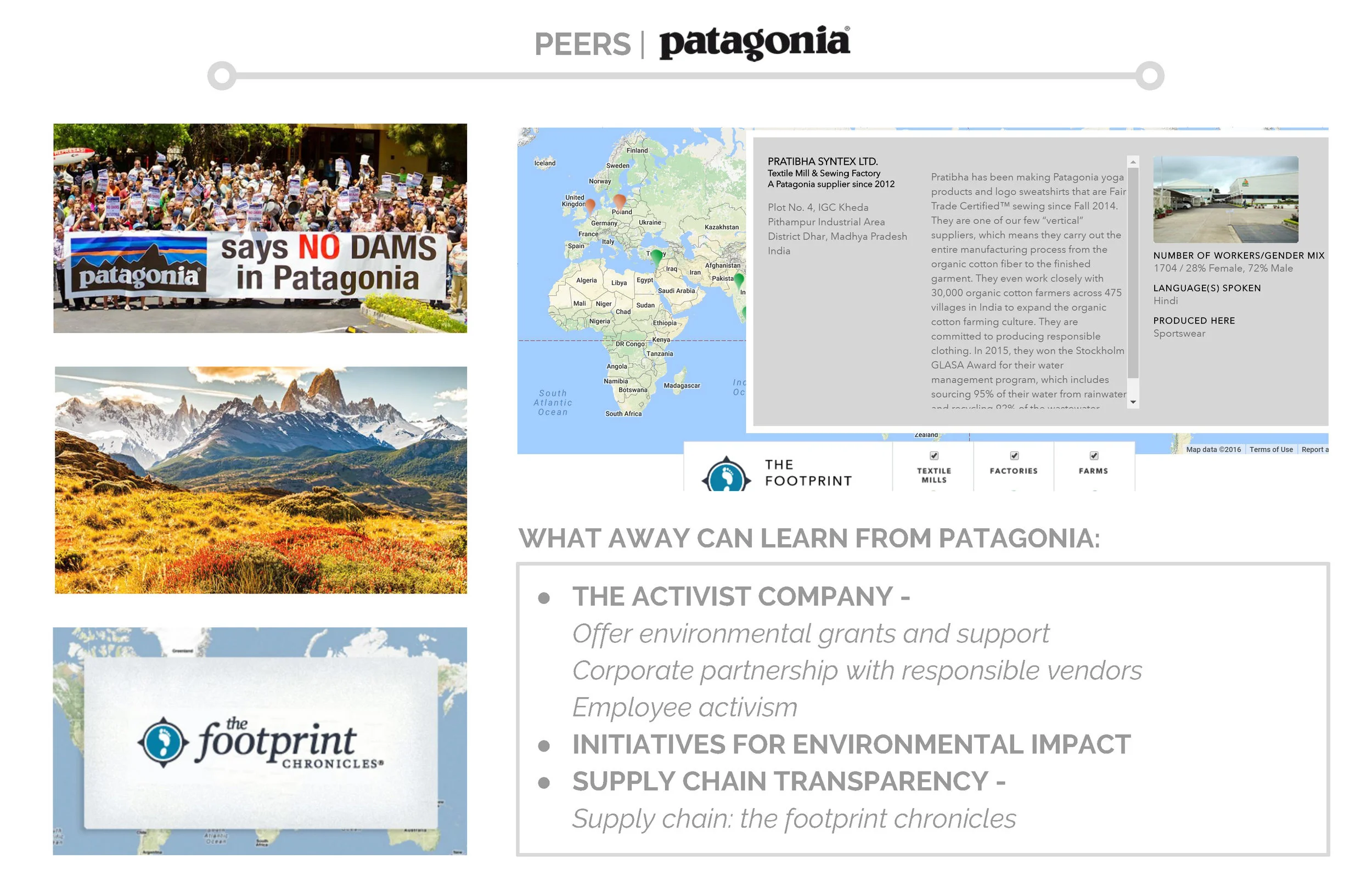
PEERS (ASPIRATIONS)
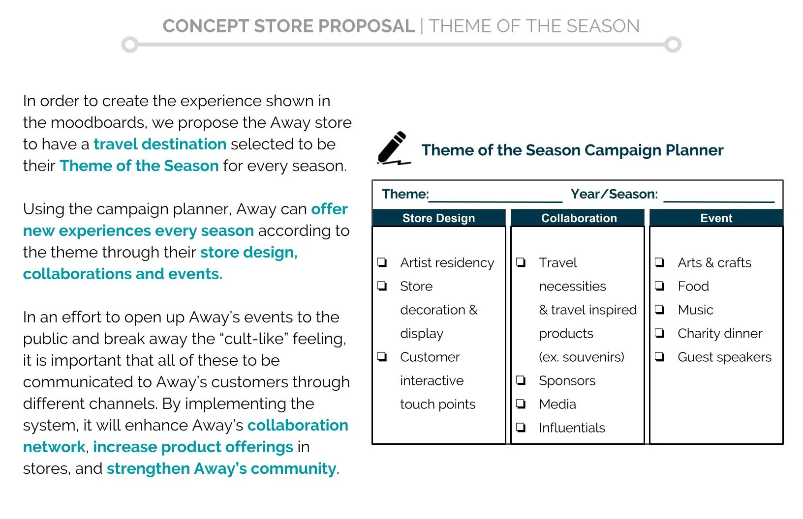
CONCEPT STORE PROPOSAL
ONLINE PRESENCE PROPOSAL
// Homepage
The homepage of the website is re-branded in an effort to enhance its visual communication.
The website now emphasizes the travel lifestyle aspect of Away and replaces the previously heavily luggage-focused home page.
// Shop Page
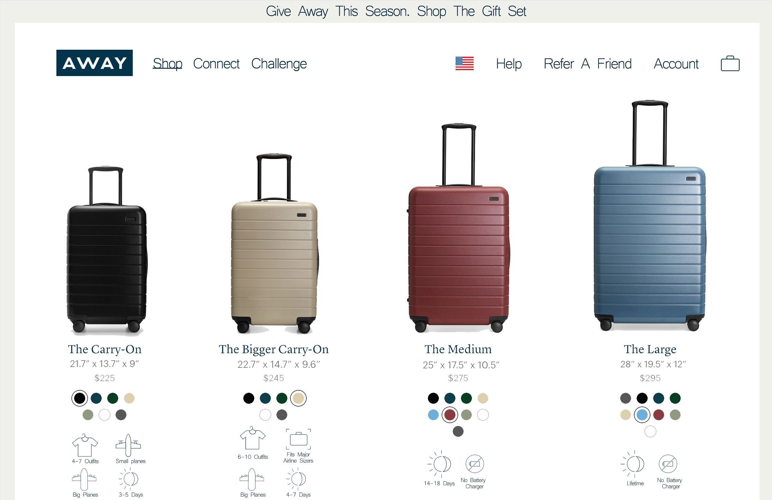
The "Compare" tab info is now merged with the "Shop" tab, creating a better user experience when shopping for products online.
// Connect Page
To enhance Away’s mission, we propose to include a “Connect” page with the goal to bring Away’s customers and community together by showing relevant content that are both Away and customer generated. The "Upgrade" page is now part of this section, providing specially curated travel guide by Away experts that are categorized by the purpose of trip, instead of the destination.
// Challenge Page
We propose that Away to have a quarterly design challenge for the upcoming season in correspondence with the Theme of the Season campaign. The idea is to expand on Away’s Monogram initiative . The challenge offers opportunities to students around the globe and help grow the Away community.
